Built for the release
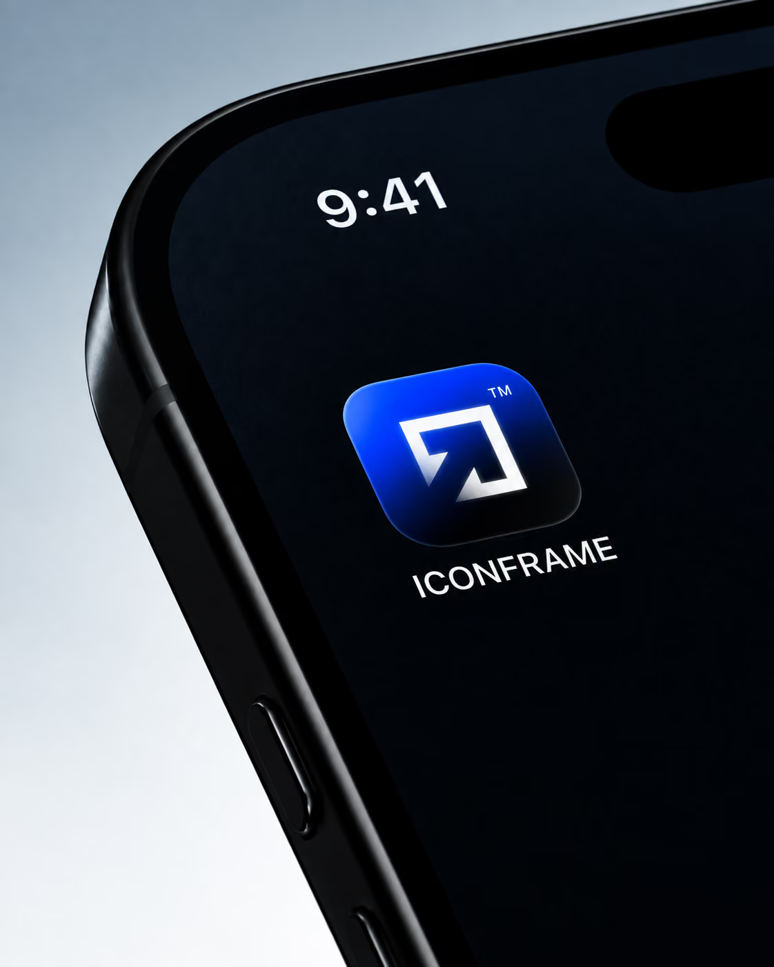
IconFrame was created as a digital-first creative platform for music releases. The identity needed to work as a studio, a service and a product at the same time, clear enough to navigate, but distinctive enough to stand on its own.
The result is a compact visual system built around strong typography, a single electric blue and a modular identity that moves easily between the website, social content and the work itself.
A frame in motion
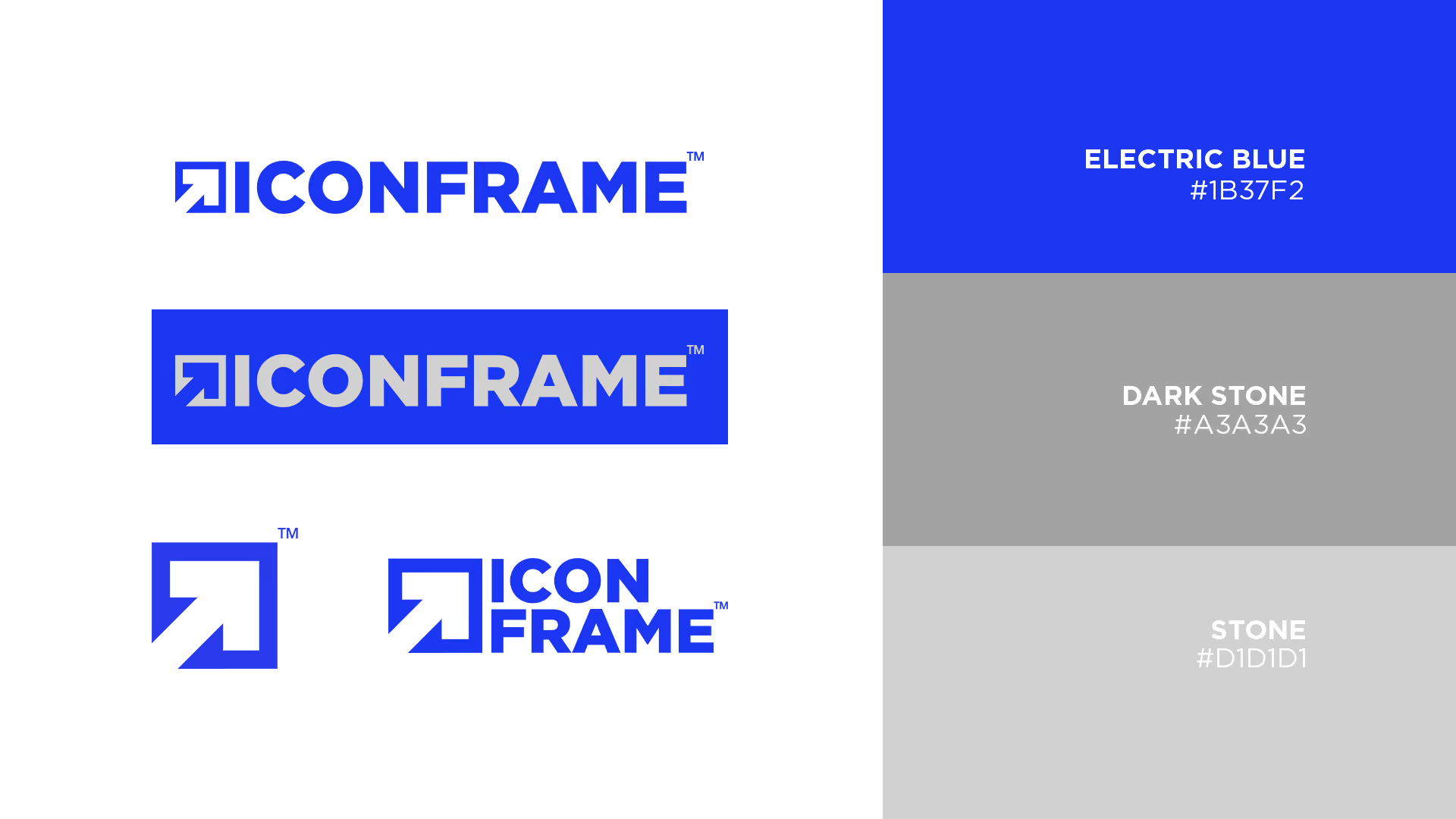
The symbol reduces the idea of a frame to a simple directional form, part container, part movement. Combined with the wordmark, it gives IconFrame a system that can expand, crop, repeat and adapt without losing recognition.
The different lockups were designed to behave as parts of the same identity rather than separate logos, allowing the brand to shift between interface, communication and application.